One project owns the artifacts
Datasets, the Blueprint, Metrics Sheet, Viz Assembly, HTML Kit, and planner all refer to the same build context.
A workspace that keeps discovery, demo datasets, metric definitions, visualization plans, and presentation components connected, so a consultant can carry one consistent story into the final analytics platform.
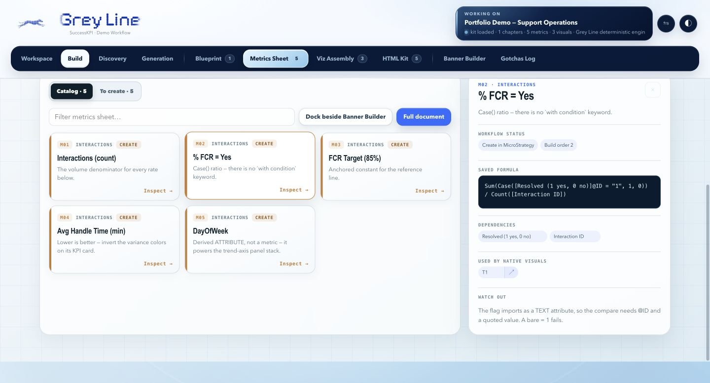
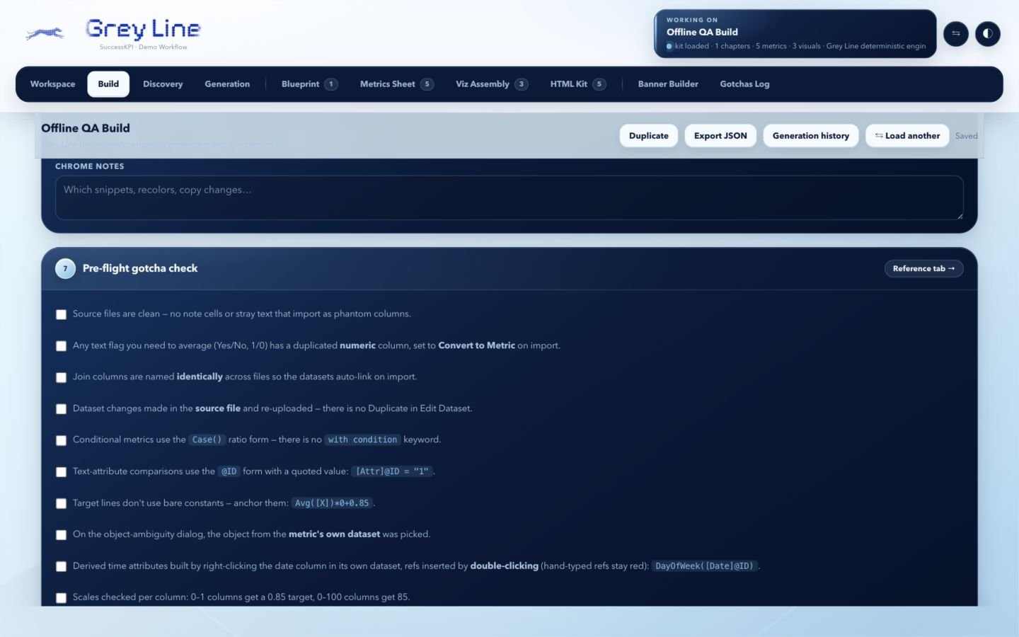
The Metrics Sheet and planner screenshots show a fresh, entirely synthetic support-operations demonstration generated in Greyline’s deterministic mode. The validation screen is a saved synthetic QA build. No customer discovery records are included.
A useful analytics demo starts well before the dashboard. The discovery questions, dataset, metric definitions, visualization choices, and implementation instructions all need to agree.
I built Greyline during my solutions-consulting internship to make that preparation reusable. The goal was to give the next person a coherent build kit they could understand and carry forward, rather than a collection of disconnected outputs.
I owned the architecture, analytical logic, implementation, testing, iteration, and handoff. I also built a Python MCP server with nine tools for tasks such as dataset profiling, formula validation, and checking claims against source data. The SuccessKPI Solutions team adopted the application for continued use.
Capture the audience, use case, story, datasets, and intended dashboard structure.
A shared generation workflow records the request and maps its output into synchronized project artifacts.
Review formulas, dependencies, visualization assignments, page layout, and reusable HTML components.
A consultant imports the data and constructs the native metrics and visuals in the target analytics platform.
Actual screens, with the reasoning beside them
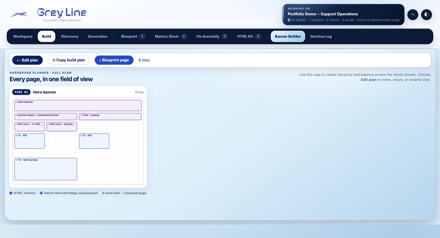
The Dashboard Planner opens with the active project’s HTML components and native visualization plan already arranged. In this synthetic example, eight planned tiles make the page structure visible before the final dashboard is assembled.
The distinction between HTML presentation elements and native analytics visuals matters: the blueprint tells the builder what each object is, instead of treating the whole dashboard as an opaque picture.
The preparation checklist carries forward practical issues such as import types, joins, metric scales, and the formula syntax expected by the analytics platform.
The metric view goes further: its first-contact-resolution definition includes the exact formula, dependencies, build order, and a warning about comparing a text attribute to a quoted value. That detail helps another person reproduce the intended calculation.
The synthetic portfolio run generated a 450-row interaction dataset, one chapter, five metric/object definitions, three native visualization definitions, and five HTML components. These counts describe this example, not a product limit or customer deployment.
Datasets, the Blueprint, Metrics Sheet, Viz Assembly, HTML Kit, and planner all refer to the same build context.
The standalone workflow uses a deterministic browser engine. Optional provider adapters are separate; a local result is not presented as a cloud-model response.
Copyable formulas, explicit dependencies, visual plans, and validation guidance make the handoff part of the product.
The application was adopted internally by the Solutions team. It prepares a dashboard build kit; it does not directly author a production MicroStrategy dashboard. The screens here show the Grey Line release. Later project materials use the name DTD, or Data to Dashboard.
Continue improving the generation, verification, and handoff workflow while keeping the dataset, metrics, and page plan consistent.